Comment System

[disqus]

Friday, June 24, 2016

How Gender and Race Affect Police Interactions

Recently, police violence has become the focus of a lot of media attention. It has formed many protests and organizations around reducing police violence. Many of the organizations are specially focused on reducing violence toward blacks because it is a problem disproportionately effecting the black community. This post seeks to investigate some of these claims and understand the relationship between the violence each ethnic group experiences and their violence against police.

The following graphics come from a conversation about disparities between races when it comes to police killings. The discussion turned to the fact that only some disparities are thought of as problems of the system but others are generally thought to be acceptable. For example, blacks make up about 11% of the population, but 29% of the police killings. This disparity is largely seen as racism in the law enforcement and the overall justice system. Critics of this assumption usually point to the higher rates of crimes committed by blacks compared to whites and other races. However, the use of crime statistics from, what some believe is a racist institution is not a good method for explaining the differences in police kill rates.

Another group that is disproportionately killed, compared to their percentage of the population, is men.  Males make up a little less than half of the population (49.1%), but are 94.2% of the police killing victims. However, no one asserts the justice department to be sexist. The group discussing this matter largely agreed the reason for men to disproportionately be killed by police is because men most likely kill police more than women.

The follow graphic was created to compare the population, the proportion of people killed by police, and the number of police killed, broken down by gender. Men make up 94.2% of police killings, but also were responsible for 97.5% of police murders. This means while only half the population, men are 16 times more likely to be killed by police than compared to women. However, the killer of a police officer is 39 times more likely to be a man compared to a woman.

A similar graphic was created broken down by race (Note: http://killedbypolice.net/ did not use the method of classifying asians as the population data and FBI, so asians was included in "Other" for the people killed by police. Also the FBI defines hispanics as a subset of whites and not their own category so this is why hispanics are not represented in the "Killed Police" section). The chart below shows blacks are much more likely to be killed by police compared to their portion of the population, however while only being 29.5% of the people killed by police and 11% of the population, 43% of police officers are killed by blacks. 
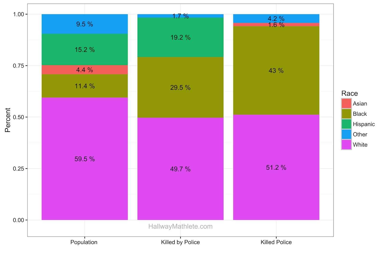
Personally, I do not believe you can say that one race can be expected to be killed more because they kill police more. I believe, unlike gender, there are socio-economic differences between the groups that could lead to a greater likelihood of turning to crime because of lack of economic opportunity. Another factor is the populations are not perfectly comparable. Whites and asians households have fewer children than black and hispanics [3]. This leads to a lower ratio of old people to young people in the black and hispanics populations. Since the vast majority of people committing murders and/or being killed by police are young, populations with fewer old people will look like they commit more murders per capita.

Below is the R code used to generate the plots.


Sources
[1] http://killedbypolice.net/ (May 2, 2013)
[2] https://www.fbi.gov/about-us/cjis/ucr/leoka/2013/tables/table_44_leos_fk_race_and_sex_of_known_offender_2004-2013.xls (April 10, 2016)
[3] http://www.pewsocialtrends.org/2012/05/17/explaining-why-minority-births-now-outnumber-white-births/ (April 29, 2016)

ewl e2earh maeh armaly2'i fi rmehiiarm
mmîW Srn'eW ,mtehaded pbii e ¡idada Sehîie

CPu1s)

This text was recognized by the built-in Ocrad engine. A better transcription may be attained by right clicking on the selection and changing the OCR engine to "Tesseract" (under the "Language" menu). This message can be removed in the future by unchecking "OCR Disclaimer" (under the Options menu). More info: http://projectnaptha.com/ocrad


########################### R Code ################################ 

######### By Race ###########
# Cop killing graphic
# https://www.fbi.gov/about-us/cjis/ucr/leoka/2013/tables/table_44_leos_fk_race_and_sex_of_known_offender_2004-2013.xls
cop_killer_race <- c("White", "Black", "Asian", "Other")
cop_killer_quanity <- c(289, 243, 9, 24)
variable <- rep("Killed Police", length(cop_killer_race))
percent <- cop_killer_quanity/sum(cop_killer_quanity)
cop_killer <- data.frame(race=cop_killer_race, quanity=cop_killer_quanity, type=variable, percent=percent)
 
# People killed by cops
# Source killedbypolice.net (May 2, 2013)
cop_killed_race <- c("White", "Black", "Hispanic", "Other")
cop_killed_quanity <- c(782, 464, 302, 26)
variable <- rep("Killed by Police", length(cop_killed_race))
percent <- cop_killed_quanity/sum(cop_killed_quanity)
killed_by_cop <- data.frame(race=cop_killed_race, quanity=cop_killed_quanity, type=variable, percent=percent)
 
#Population Data
population_race <- c("White", "Black", "Asian", "Hispanic", "Other")
population_quanity <- c(196817552, 37685848, 14465124, 50477594, 28116441+2932248+540013)
variable <- rep("Population ", length(population_race))
percent <- population_quanity/sum(population_quanity)
population <- data.frame(race=population_race, quanity=population_quanity, type=variable, percent=percent)
 
# Bind the three data frames
data <- rbind(population, killed_by_cop, cop_killer )
 
# Calc the placement of the percent text in the graph
df <- data
df <- transform(df, mid_y = ave(df$percent, df$type, FUN = function(val) cumsum(val) - (0.5 * val)))
 
# Plot
ggplot(data=df, aes(x=type, y=quanity, fill=race, label=paste(round(percent*100,1),"%"))) +
geom_bar(stat="identity", position = "fill") + labs(x = "", y = "Percent", fill = "Race") +
geom_text(aes(y = mid_y)) + theme_bw() +
annotate("text", label = "HallwayMathlete.com", x = 2, y = -.03, size = 4, colour = "gray")
 
######### By Gender ###########
# Gender Women killed
# https://www.fbi.gov/about-us/cjis/ucr/leoka/2013/tables/table_44_leos_fk_race_and_sex_of_known_offender_2004-2013.xls
cop_killer_gender <- c( "Female", "Male", "Not Reported")
cop_killer_quanity <- c(13, 551, 1)
variable <- rep("Killed Police", length(cop_killer_gender))
percent <- cop_killer_quanity/sum(cop_killer_quanity)
cop_killer <- data.frame(race=cop_killer_gender, quanity=cop_killer_quanity, type=variable, percent=percent)
 
# People killed by cops
# Source killedbypolice.net (May 2, 2013)
cop_killed_gender <- c("Female", "Male","Not Reported")
cop_killed_quanity <- c( 177,2916, 2)
variable <- rep("Killed by Police", length(cop_killed_gender))
percent <- cop_killed_quanity/sum(cop_killed_quanity)
killed_by_cop <- data.frame(race=cop_killed_gender, quanity=cop_killed_quanity, type=variable, percent=percent)
 
#Population Data
population_gender <- c("Female","Male")
population_quanity <- c(143368343, 138053563)
variable <- rep("Population ", length(population_gender))
percent <- population_quanity/sum(population_quanity)
population <- data.frame(race=population_gender, quanity=population_quanity, type=variable, percent=percent)
 
# Bind the three data frames
data <- rbind(population, killed_by_cop, cop_killer )
 
# Calc the placement of the percent text in the graph
df <- data
df <- transform(df, mid_y = ave(df$percent, df$type, FUN = function(val) cumsum(val) - (0.5 * val)))
 
# Plot
ggplot(data=df, aes(x=type, y=quanity, fill=race, label=paste(round(percent*100,1),"%"))) +
geom_bar(stat="identity", position = "fill") + labs(x = "", y = "Percent", fill = "Race") +
geom_text(aes(y = mid_y)) + theme_bw() +
annotate("text", label = "HallwayMathlete.com", x = 2, y = -.03, size = 4, colour = "gray")

Sunday, May 29, 2016

Salaries of Presidential Primary Voters by Candidate and State

The data used in this post comes from FiveThirtyEight and are put into easy to understand graphics. The first graphic shows the average salary of supports of each candidate by state. The states are ranked by highest average salary, Maryland, to the state with the lowest salary, Mississippi. The red line shows the average salary for each state. The first obvious conclusion is that John Kasich supporters make about $5-10 thousand more than supporters of other candidates. Second, in low salary states Clinton and Sanders supporter's have similar salaries, but when looking at higher salary states, Clinton supporters' salaries are even with Trump and Cruz supporters' salaries.


The following plot shows the distribution of average salaries for each Presidential Candidate. Again we see similar trends as before with Kasich having a high average income and Clinton having a mix of low and high income supporters.


The last plot shows the relationship between the average salary of a state and the average salary of a candidate's supporters. The red line is a perfect 1 to 1 ratio and the closer a candidate is to the red line the closer the candidate's supporters are to having the same salary as the average person of that state. The reason for almost all the dots falling above the line is because people with below average salaries are less likely to vote.


If you have any suggestions for plots using this data, please share in the comment section.


Note:

[1] All states are not included because all states have not held elections yet.

Monday, May 2, 2016

Introduction to Machine Learning with Random Forest

The purpose of this tutorial is to serve as a introduction to the randomForest package in R and some common analysis in machine learning.


Part 1. Getting Started

First step, we will load the package and iris data set. The data set contains 3 classes of 50 instances each, where each class refers to a type of iris plant. One class is linearly separable from the other 2; the latter are NOT linearly separable from each other.

Part 2. Fit Model

Now that we know what our data set contains, let fit our first model. We will be fitting 500 trees in our forest and trying to classify the Species of each iris in the data set. For the randomForest() function, "~." means use all the variables in the data frame.

Note: a common mistake, made by beginners, is trying to classify a categorical variable that R sees as a character. To fix this, convert the variable to a factor like this randomForest(as.factor(Species) ~ ., iris, ntree=500)

fit <- randomForest(Species ~ ., iris, ntree=500)

The next step is to use the newly create model in the fit variable and predict the label.

results <- predict(fit, iris)
summary(results)

After you have the predicted labels in a vector (results), the predict and actual labels must be compared. This can be done with a confusion matrix. A confusion matrix is a table of the actual vs the predicted with the diagonal numbers being correctly classified elements while all others are incorrect.


# Confusion Matrix
table(results, iris$Species)


Now we can take the diagonal points in the table and sum them, this will give us the total correctly classified instances. Then dividing this number by the total number of instances will calculate the percentage of prediction correctly classified. <- -="" 1="" accuracy="" correctly_classified="" div="" error="" iris="" length="" pecies="" results="" style="overflow: auto;" table="" total_classified="">

# Calculate the accuracy  
correctly_classified <- table(results, iris$Species)[1,1] + table(results, iris$Species)[2,2] + table(results, iris$Species)[3,3] 
total_classified <- length(results)  
# Accuracy  
correctly_classified / total_classified   
# Error  
1 - (correctly_classified / total_classified)

Part 3. Validate Model 

The next step is to validate the prediction model. Validation requires splitting your data into two sections. First, the training set, which will be used to create the model. The second will be the test set and will test the accuracy of the prediction model. The reasoning for splitting the data is to allow a model to be created using one data set and then reserving some data, where the output is already known, to "test" the model accuracy. This more effectively estimates the accuracy of the model by not using the same data used to create the model and predict the accuracy.

# How to split into a training set   
rows <- nrow(iris) col_count <- c(1:rows)  
Row_ID <- sample(col_count, rows, replace = FALSE)   
iris$Row_ID <- Row_ID   
 
# Choose the percent of the data to be used in the training
data training_set_size = .80   
#Now to split the data into training and test
 index_percentile <- rows*training_set_size   
# If the Row ID is smaller then the index percentile, it will be assigned into the training set  
train <- iris[iris$Row_ID <= index_percentile,]   
# If the Row ID is larger then the index percentile, it will be assigned into the training set  
test <- iris[iris$Row_ID > index_percentile,]   
train_data_rows <- nrow(train)   
test_data_rows <- nrow(test)   
total_data_rows <- (nrow(train)+nrow(test)) train_data_rows / total_data_rows     
 
# Now we have 80% of the data in the training set  test_data_rows / total_data_rows    
# Now we have 20% of the data in the training set  
# Now lets build the randomforest using the train data set  
fit <- randomForest(Species ~ ., train, ntree=500) 
  
After the test set is predicted, a confusion matrix and accuracy must be calculated.

# Use the new model to predict the test set   
results <- predict(fit, test, type="response")   
# Confusion Matrix  
table(results, test$Species)  
# Calculate the accuracy  
correctly_classified <- table(results, test$Species)[1,1] + table(results, test$Species)[2,2] + table(results, test$Species)[3,3] total_classified <- length(results)   
# Accuracy  
correctly_classified / total_classified  
# Error  
1 - (correctly_classified / total_classified)

Part 4. Model Analysis 

After the model is created, understanding the relationship between variables and number of trees is important. R makes it easy to plot the errors of the model as the number of trees increase. This allows users to trade off between more trees and accuracy or fewer trees and lower computational time.

fit <- randomForest(Species ~ ., train, ntree=500)   
results <- predict(fit, test, type="response")  
 
# Rank the input variables based on their effectiveness as predictors  
varImpPlot(fit)   
# To understand the error rate lets plot the model's error as the number of trees increases  
plot(fit)

Part 5. Handling Missing Values 

The last section of this tutorial involves one of the most time consuming and important parts of the data analysis process, missing variables. Very few machine learning algorithms can handle missing data in the data. However the randomForest package contains one of the most useful functions of all time, na.roughfix(). Na.roughfix() takes the most common factor in that column and replaces all the NAs with it. For this section we will first create some NAs in this data set and then replace them and run the prediction algorithm.

# Create some NA in the data.   
iris.na <- iris for (i in 1:4)  
iris.na[sample(150, sample(20)), i] <- NA   
 
# Now we have a dataframe with NAs  
View(iris.na)   
#Adding na.action=na.roughfix  
#For numeric variables, NAs are replaced with column medians.  
#For factor variables, NAs are replaced with the most frequent levels (breaking ties at random) 
iris.narf <- randomForest(Species ~ ., iris.na, na.action=na.roughfix) 
results <- predict(iris.narf, train, type="response")


Congratulations! You now know how to create machine learning models, fit data using those models, test the model’s accuracy and display it in a confusion matrix, how to validate the model, and quickly replace missing variables. All of these are the basic fundamental skills in machine learning!

Thursday, April 21, 2016

R Stat Job Boards List

Tuesday, March 15, 2016

One of the Best and Most Underutilized Graphs in ggplot2


Understanding how a distribution of a variable changes over time can make a great visualization. These highly intuitive graphics can display a lot of information and can be simply rendered in R using ggplot2. However, based on my experience, they are one of the most underutilized graphs in R.

A good example of this style of graph is from my research. My research studies how data analysis can be utilized to improve the product design and manufacturing process. The style of graph discussed in this post is extremely useful for showing how design specifications change over time. Below you can see an example of how the specifications of secondary cameras on cellphones has changed over time.  It is easily seen that before 2011, there was almost no secondary cameras and by 2015, almost all cameras released had some form of secondary camera.

To create these plots, first lets load ggplot2 and the diamond data set.

library(ggplot2)
data(diamonds)
head(diamonds)
When creating these plots, I like to make sure I under stand how the data is distributed over the x axis. This is helpful because if there is a section of x-axis with much fewer data points, the distribution of the y-axis can change rapidly over the x-axis due to low samples.

The plot below shows the distribution of diamonds grouped by cut as the price changes.

ggplot(data=diamonds, aes(x=price, group=cut, fill=cut, position="stack")) + 
geom_density(adjust=1.5)


In the next plots instead of the count in the y-axis, the y-axis is the percent of each group (cut for the first example and clarity for the second) for different prices.

ggplot(data=diamonds,aes(x=price, group=cut, fill=cut, position="stack")) + 
geom_density(adjust=1.5, position="fill")


ggplot(data=diamonds,aes(x=price, group=clarity, fill=clarity, position="stack")) +
 geom_density(adjust=1.5, position="fill")


Disqus Shortname

http-www-hallwaymathlete-com